Navbar on Bootstrap
This is the other challenge that I’ve completed on the Frontend Mentor. I might write a separate post about this website because it’s changing almost every month. But going back to the challenge that I’ve completed.
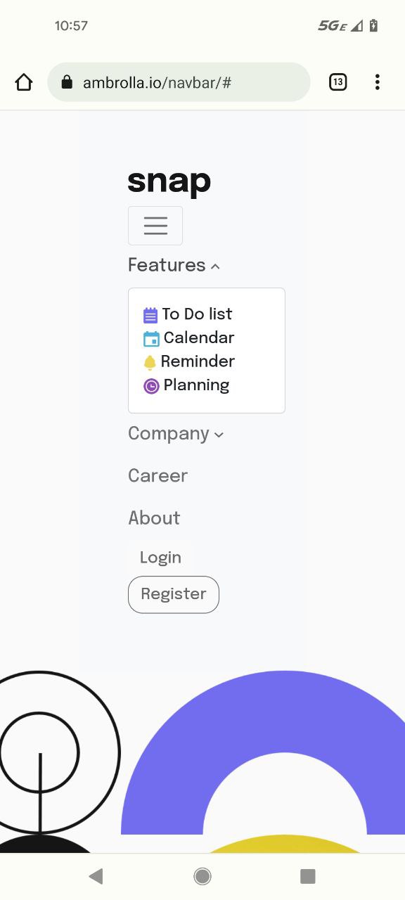
One of the tasks there was to create a page that has a navbar with the dropdown menu, and the page content. In the mobile version of this task, it has to be folded and the menu in the navbar should be expanding.
I’ve decided to make it more challenging for me and complete it without using any frameworks (libraries) such as React whatsoever (I should have). It’s made with plain JS (asynch await function) + Bootstrap + flexboxes. I’ve learned so much more about Bootstrap with this challenge!
Code can be found here
See it in real life here
Screenshots are below.
It looks like this on the desktop version:


Mobile version (it looks slightly different depending on what screen is it shown on. This is the screenshot from my personal phone):
Active state:
Plain mobile state: